Histogram
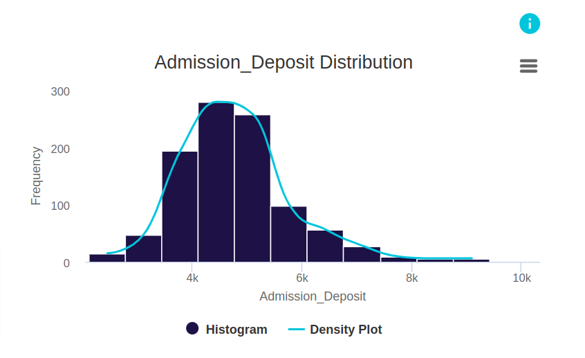
This histogram and density plot give the distribution of the admission deposits paid by patients admitted to hospital. The x-axis gives the range of values of deposits divided into equal-sized bins. The y-axis gives the frequency or the count for each bin. In interpreting the histogram, we see that the frequencies are higher for bins closer to 4k. We also see that more to the left, there are less bins, but they have higher frequencies. To the right there are more bins but with lesser frequencies. Looking at this information we can understand that more individuals pay a lower deposit, with the most number of people paying a deposit around 4.5k. We further understand that a few individuals pay higher deposits and this can go upto around 9.5k.
Intuition
What is the histogram plot:
We can plot the residuals of the probabilities of the predictions in a regression problem. The residuals histogram measures how far the predicted probabilities of a regression model differ from the actual values of the target. In addition, histograms are graphs that display the shape of the distribution, its central tendency, and the spread of values in your sample data.

Histograms, Central Tendency, and Variability
In the field of statistics, we often use summary statistics to describe an entire dataset. These statistics use a single number to quantify a characteristic of the sample. For example, a measure of central tendency is a single value that represents the center point or typical value of a dataset, such as the mean. A measure of variability is another type of summary statistic that describes how spread out the values are in your dataset. The standard deviation is a conventional measure of dispersion.


Histograms and Skewed Distributions
Histograms are an excellent tool for identifying the shape of your distribution. The shape of the distribution is a fundamental characteristic of our sample that can determine which measure of central tendency best reflects the center of your data. Relatedly, the shape also impacts your choice between using a parametric or nonparametric hypothesis test. In this manner, histograms are informative about the summary statistics and hypothesis tests that are appropriate for your data. For skewed distributions, the direction of the skew indicates which way the long tail extends. For right-skewed distributions, the long tail extends to the right while most values cluster on the left. Conversely, for left-skewed distributions, the long tail extends to the left while most values cluster on the right.


Using Histograms to Identify Outliers
Histograms can help us to identify the potential outliers in our sample. Are these data entry errors or represent observations that occurred under unusual conditions? Or, perhaps they are legitimate observations that accurately describe the variability in the study area.

Identifying Multimodal Distributions with Histograms
A multimodal distribution has more than one peak. It's easy to miss multimodal distributions when focusing on summary statistics, such as the mean and standard deviations. Consequently, histograms are the best method for detecting multimodal distributions. In some cases, multimodal distributions indicate that we are combining subpopulations with different characteristics. Histograms can help confirm the presence of these subpopulations and illustrate how they're different from each other. In other words, we can use histograms to identify subpopulations.

References: