Credit Default Risk
Overview
This notebook demonstrates how to use evoML to build a predictive model for credit default risk. We leverage the Kaggle - Give Me Some Credit dataset, focusing on evaluating the likelihood of serious delinquencies in credit repayments. In this notebook we will:
- Perform data preparation and exploratory data analysis (EDA).
- Upload data to evoML for automated machine learning.
- Run a trial to build predictive models.
- Run a pipeline locally and visualize predictions.
This notebook also be viewed at https://nbviewer.org/url/docs.evoml.ai/notebooks/give-me-some-credit.ipynb.
Setup
Dependencies
turintech-evoml-clientpandasnumpymatplotlib
import pandas as pd
import numpy as np
import matplotlib.pyplot as plt
from typing import Final

import evoml_client as ec
from evoml_client.trial_conf_models import BudgetMode
Credentials and Dataset
To connect to evoML and upload the dataset, you will need:
- A URL for the evoML platform.
- Your evoML username and password.
- The Give Me Some Credit dataset from Kaggle.
API_URL: Final[str] = "https://evoml.ai"
EVOML_USERNAME: Final[str] = ""
EVOML_PASSWORD: Final[str] = ""

# Connect to evoML platform
ec.init(base_url=API_URL, username=EVOML_USERNAME, password=EVOML_PASSWORD)
Data Preparation
Loading the Data
We begin by loading the "Give Me Some Credit" dataset and preparing it for analysis. The target column, SeriousDlqin2yrs, indicates whether an individual has experienced a 90-day past-due delinquency or worse within a two-year timeframe.
# Load datasets
data = pd.read_csv("cs-training.csv", index_col=0)
data.columns = data.columns.str.replace('-', '_')
target_column = "SeriousDlqin2yrs"

data_holdout = pd.read_csv("cs-test.csv", index_col=0)
data_holdout.columns = data_holdout.columns.str.replace('-', '_')
data_holdout = data_holdout.drop(columns=[target_column])
Exploratory Data Analysis
Target Variable: SeriousDlqin2yrs
The target variable is binary, with 1 representing default and 0 representing no default. Let's examine its distribution.
class_percentages = data[target_column].value_counts(normalize=True)
plt.figure(figsize=(15, 6))
class_percentages.plot(kind="bar", color=["steelblue", "darkorange"])
plt.title("Target Distribution")
plt.xlabel("Target Class")
plt.ylabel("Proportion")
plt.tight_layout()
plt.show()
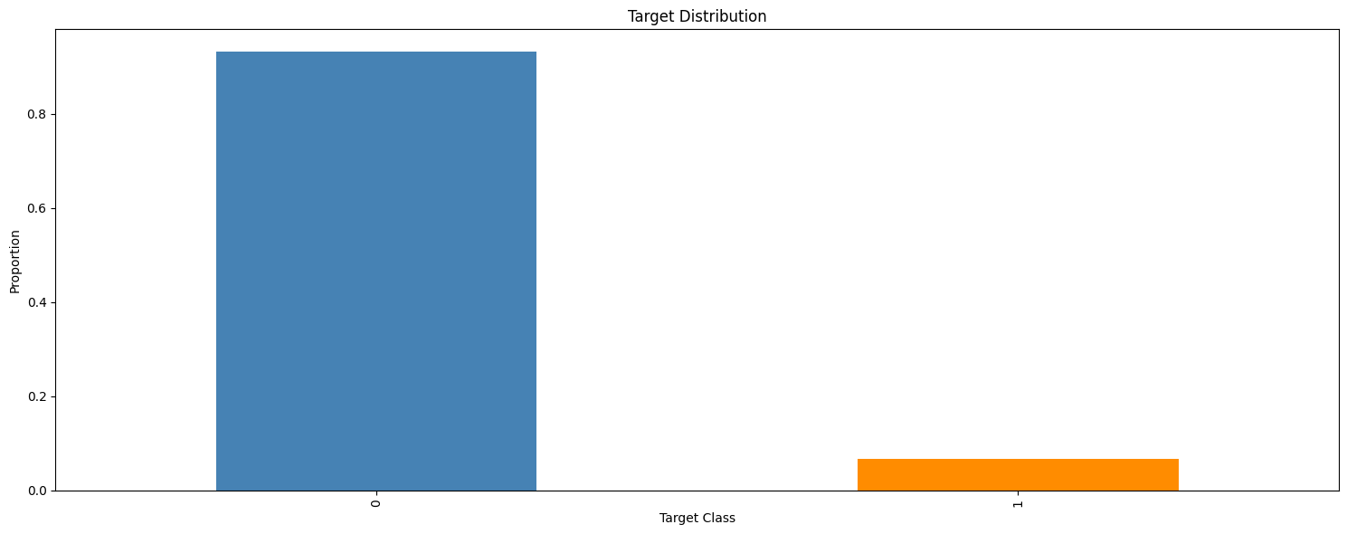
The dataset is imbalanced, with approximately 93% of instances belonging to the negative class (0). This imbalance necessitates careful metric selection and possibly data resampling.
Feature Distributions by Target Class
Below, we visualize feature distributions conditioned on the target variable. The data is clipped to the 1st and 99th percentiles to handle outliers.
# Identify numeric columns (excluding the target)
numeric_cols = [
    col for col in data.columns
    if pd.api.types.is_numeric_dtype(data[col]) and col != target_column
]

# Calculate the number of rows and columns for the subplots grid
n_cols = 2
n_rows = int(np.ceil(len(numeric_cols) / n_cols))

# Create subplots with a dynamic figure size
fig, axes = plt.subplots(n_rows, n_cols, figsize=(15, 2.5 * n_rows))
fig.suptitle("Feature Distributions by Target Class", fontsize=16)
axes = axes.flatten()  # Flatten the axes array for easier iteration

# Initialize variables for legend handles and labels
handles, labels = None, None

for i, col in enumerate(numeric_cols):
    # Filter data for each target class and drop missing values
    data_class0 = data[data[target_column] == 0][col].dropna()
    data_class1 = data[data[target_column] == 1][col].dropna()

    # Combine the data to compute shared percentile limits for clipping
    all_data = pd.concat([data_class0, data_class1])
    lower_limit, upper_limit = np.percentile(all_data, [1, 99])

    # Clip the data to mitigate outlier impact
    data_class0_clipped = data_class0.clip(lower=lower_limit, upper=upper_limit)
    data_class1_clipped = data_class1.clip(lower=lower_limit, upper=upper_limit)

    # Create shared bins based on the combined, clipped data
    shared_bins = np.histogram_bin_edges(
        pd.concat([data_class0_clipped, data_class1_clipped]), bins=20
    )

    # Plot the histograms for both classes on the current axis
    axes[i].hist(
        data_class0_clipped, bins=shared_bins, alpha=0.6, density=True, label="Class 0"
    )
    axes[i].hist(
        data_class1_clipped, bins=shared_bins, alpha=0.6, density=True, label="Class 1"
    )

    # Label the current axis
    axes[i].set_xlabel(col)
    axes[i].set_ylabel("Density")

    # Capture legend information from the first subplot only
    if handles is None or labels is None:
        handles, labels = axes[i].get_legend_handles_labels()

# Remove any empty subplots if the grid contains extra axes
for j in range(len(numeric_cols), len(axes)):
    fig.delaxes(axes[j])

# Add a legend to the figure
fig.legend(handles, labels, loc="lower center", ncol=2, fontsize=12)

# Adjust layout to fit the legend and titles
plt.tight_layout(rect=[0, 0.05, 1, 0.95])
plt.show()
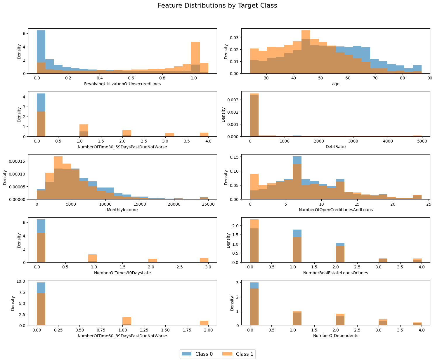
Several features, such as RevolvingUtilizationOfUnsecuredLines, age, and NumberOfTimes90DaysLate show clear differences in distribution between the target classes, suggesting their predictive value.
Uploading Data to evoML
Using the evoML client, we upload the dataset for model training.
dataset = ec.Dataset.from_pandas(data, name="Give Me Some Credit")
dataset.put()
dataset.wait()

print(f"Dataset URL: {API_URL}/platform/datasets/view/{dataset.dataset_id}")
Running a Trial
We configure and run a trial to build predictive models, optimizing for the Area Under the Receiver Operating Characteristic Curve (AUC-ROC). This trial may take ~15 minutes to complete.
config = ec.TrialConfig.with_default(
    task=ec.MlTask.classification,
    budget_mode=BudgetMode.fast,
    loss_funcs=["ROC AUC"],
    dataset_id=dataset.dataset_id,
)

# Trying disabling hyperparameter tuning for faster trial execution
# config.enableBudgetTuning = False

trial, _ = ec.Trial.from_dataset_id(
    dataset.dataset_id,
    target_col=target_column,
    trial_name="Give Me Some Credit",
    config=config,
)

trial.run(timeout=900)
Results and Metrics
We retrieve and display the trial results, focusing on validation and test set performance.
metrics = trial.get_metrics_dataframe()
selected_metrics = metrics.loc[:, pd.IndexSlice["classification-roc", ["validation", "test"]]]
print(selected_metrics.sort_values(by=("classification-roc", "validation"), ascending=False).iloc[:5])
| model | validation | test |
|---|---|---|
| xgboost_classifier-28123 | 0.862143 | 0.866853 |
| xgboost_classifier-6427c | 0.862123 | 0.867130 |
| lightgbm_classifier-baf47 | 0.862006 | 0.867012 |
| xgboost_classifier-72e5b | 0.861743 | 0.866156 |
| xgboost_classifier-5ad79 | 0.861501 | 0.867293 |
The best performing model achieves a ROC AUC of approximately 0.87, making it competitive with the best solutions on the Kaggle leaderboard.
Interacting with Pipelines
We retrieve the best model and build the best performing model locally. This can take a minute or so.
best_model = trial.get_best()
best_model.build_model()
Visualising Predictions
Finally, we visualize the predicted default probabilities for the holdout dataset. We compare the distributions of predicted probabilities for individuals who have and have not experienced a 90-day past-due delinquency (NumberOfTimes90DaysLate).
# Predict default probabilities on the holdout data
predictions = np.array(best_model.predict_proba(data=data_holdout))

# Extract the probabilities for the default outcome (1)
default_probabilities = predictions[:, 1]

# Conditioned data
conditioned_data = data_holdout["NumberOfTimes90DaysLate"] == 0
probabilities_conditioned_true = default_probabilities[conditioned_data]
probabilities_conditioned_false = default_probabilities[~conditioned_data]

# Plot the histograms
plt.figure(figsize=(15, 6))

plt.subplot(1, 2, 1)
plt.hist(probabilities_conditioned_true, bins=20, alpha=0.75, color="steelblue")
plt.title("Predicted Default Probabilities (NumberOfTimes90DaysLate >= 0)")
plt.xlabel("Predicted Probability of Default (1)")
plt.ylabel("Frequency")
plt.grid(True)

plt.subplot(1, 2, 2)
plt.hist(probabilities_conditioned_false, bins=20, alpha=0.75, color="darkorange")
plt.title("Predicted Default Probabilities (NumberOfTimes90DaysLate < 0)")
plt.xlabel("Predicted Probability of Default (1)")
plt.ylabel("Frequency")
plt.grid(True)

plt.tight_layout()
plt.show()
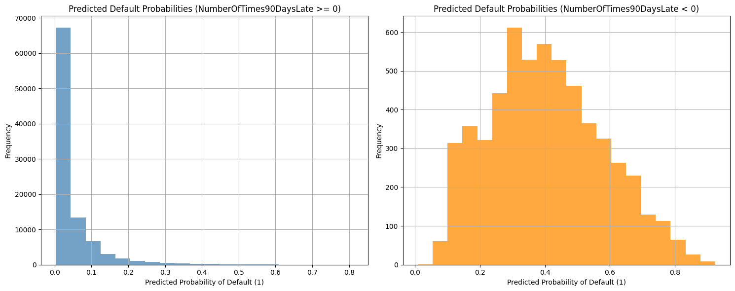
The NumberOfTimes90DaysLate feature appears to be a strong predictor of credit default risk, as evidenced by the differing distributions of predicted default probabilities for the conditioned data.