Net cash flow forecast
Overview and dataset
This Notebook uses the EvoML client to conduct a net cash flow analysis and forecast for an individual bank account holder, 28 days into the future.
The dataset used is a fully anonymised open-source bank transaction dataset from a retail customer, created as a an academic collaboration with Oakbook Finance Ltd. (see full paper here). The dataset consists of daily credit or debit transactions made between in the time period between 2015 and 2022, and can be found here.
Setup
Dependencies
To replicate this analysis, you will need the following libraries:
turintech-evoml-clientpandasmatplotlibplotlyshap
Credentials
You will also require:
- A URL for an instance of the evoML platform (e.g. https://evoml.ai)
- Your evoML username and password
import typing
from typing import Final, Dict
import math
import getpass
import pandas as pd
import numpy as np
import matplotlib.pyplot as plt
import matplotlib.gridspec as gridspec
import plotly.express as px
import plotly.graph_objects as go
from plotly.subplots import make_subplots
import shap
import evoml_client as ec
from evoml_client.trial_conf_models import (
    BudgetMode,
    HoldoutOptions,
    ValidationMethod,
    ValidationMethodOptions,
)

API_URL: Final[str] = "https://evoml.ai"
EVOML_USERNAME: Final[str] = input("EvoML Username: ")
EVOML_PASSWORD: Final[str] = getpass.getpass("EvoML Password: ")


# Connect to evoML platform
ec.init(base_url=API_URL, username=EVOML_USERNAME, password=EVOML_PASSWORD)
Data preparation
# Data reading
open_bank_data = pd.read_csv(
    'Open Bank Transaction Data - Anonymized Original with Category.csv')

# Data exploration
nans = open_bank_data[open_bank_data['Credit Amount'].isna(
) & open_bank_data['Debit Amount'].isna()]  # Nans
open_bank_data['Transaction Date'].head()

# Variable conversion
open_bank_data['Transaction Date'] = pd.to_datetime(
    open_bank_data['Transaction Date'], dayfirst=True)
Exploratory Data Analysis
We download the dataset in csv format and upload it into the script.
- We separately investigate the frequency of Debit and Credit transactions and plot the results on a daily basis.
- Next, we extract the Net Cash Flow as the daily difference between the two and resample it on a daily frequency, to ensure consistently generated daily transactions, and plot it. The visualization also removes the global minimum and maximum values with the aim of improving model accuracy in the end.
The general aim of this EDA is to identify dependencies within our data sample which could potentially be added as informative features to the final dataset.
# Filter debit transactions and plot
debit_transactions = open_bank_data[open_bank_data['Debit Amount'].notnull()]
credit_transactions = open_bank_data[open_bank_data['Credit Amount'].notnull()]

# Get day of week counts for both transaction types
debit_day_counts = debit_transactions['Transaction Date'].dt.weekday.value_counts().sort_index()
credit_day_counts = credit_transactions['Transaction Date'].dt.weekday.value_counts().sort_index()

# Ensure all days (0-6) are represented with proper day names
day_indices = list(range(7))
days_of_week = ['Monday', 'Tuesday', 'Wednesday', 'Thursday', 'Friday', 'Saturday', 'Sunday']

# Create a subplot with 1 row and 2 columns for side-by-side plots
fig = make_subplots(rows=1, cols=2,
                   subplot_titles=("Debit Transactions by Day of Week",
                                  "Credit Transactions by Day of Week"))

# Add debit transactions plot (left)
fig.add_trace(
    go.Bar(
        x=days_of_week,
        y=[debit_day_counts.get(i, 0) for i in day_indices],
        name='Debit Transactions'
    ),
    row=1, col=1
)

# Add credit transactions plot (right)
fig.add_trace(
    go.Bar(
        x=days_of_week,
        y=[credit_day_counts.get(i, 0) for i in day_indices],
        name='Credit Transactions'
    ),
    row=1, col=2
)

# Update layout
fig.update_layout(
    title_text='Transactions by Day of Week',
    showlegend=False,
    height=400,
    width=1000
)

# Update x and y axis labels
fig.update_xaxes(title_text="Day of Week", row=1, col=1)
fig.update_xaxes(title_text="Day of Week", row=1, col=2)
fig.update_yaxes(title_text="Number of Transactions", row=1, col=1)
fig.update_yaxes(title_text="Number of Transactions", row=1, col=2)

fig.show()
# Calculate net cash flow and resample daily
net_cash_flow_daily = (open_bank_data.assign(
    Net_Cash_Flow=lambda df: df['Credit Amount'].fillna(0) - df['Debit Amount'].fillna(0))
    .set_index('Transaction Date')['Net_Cash_Flow']
    .resample('D').sum())

# Identify the min and max values
min_value = net_cash_flow_daily.min()
max_value = net_cash_flow_daily.max()

# Filter out the data between the min and max values:
net_cash_flow_filtered = net_cash_flow_daily[
    (net_cash_flow_daily > min_value) & (net_cash_flow_daily < max_value)
]

# Plot the filtered net cash flow
fig = go.Figure()

fig.add_trace(
    go.Scatter(
        x=net_cash_flow_filtered.index,
        y=net_cash_flow_filtered.values,
        mode='lines',
        name='Net Cash Flow - outliers removed')
)

# Update layout
fig.update_layout(
    title='Filtered Net Cash Flow Over Time',
    xaxis_title='Date',
    yaxis_title='Net Cash Flow',
    plot_bgcolor='white',
    paper_bgcolor='white',
    #adjust size
    width=1000,
    height=400
)

fig.show()
Final dataframe preparation
Our exploratory analysis reveals several interesting trends with regards to the distribution of our data:
- We notice that debit transactions occur most frequenly on Monday. The case for credit transactions is similar, with the inclusion of Friday. Weekend transactions are not present in our dataset.
- We notice a seasonal pattern in the distribution of our target variable: there is a regular debit transfer on a monthly basis. This represents a credit transaction instantiated by Swansea University.
- With this, we can also see there is a regular money withdrawal shortly after the debit transfer. This represents a regular mortgage payment.
Here, we decide to create three calendar features: 'Is Monday' and 'Is Last Business Day', and 'Is First Business Day' in order to handle seasonality in our data and thereby improve model accuracy. Finally, we remove the timestamp column for our analysis in orer to improve interpretability and only analyse features with a relationship to our target variable.
Finally, we upload the dataset to EvoML.
# Convert the series object into a dataframe and reset the index
net_cash_flow_filtered_df = net_cash_flow_filtered.to_frame().reset_index()

# Create calendar features and convert boolean columns to integers
date_column = net_cash_flow_filtered_df['Transaction Date']
calendar_features = {
    'is Monday': (date_column.dt.weekday == 0),
    'is Last Business Day': (date_column + pd.offsets.BMonthEnd(0) == date_column),
    'is First Business Day': (date_column + pd.offsets.BMonthBegin(0) == date_column)
}

for feature, condition in calendar_features.items():
    net_cash_flow_filtered_df[feature] = condition.astype(int)

# Drop Transaction Date column
net_cash_flow_filtered_df.drop(columns=['Transaction Date'], inplace=True)

# Take a look at the final dataframe
net_cash_flow_filtered_df.head(14)
| Index | Net_Cash_Flow | is Monday | is Last Business Day | is First Business Day |
|---|---|---|---|---|
| 0 | -1322.90 | 1 | 0 | 0 |
| 1 | -6.59 | 0 | 0 | 0 |
| 2 | -92.99 | 0 | 0 | 0 |
| 3 | -7.32 | 0 | 0 | 0 |
| 4 | 3489.92 | 0 | 1 | 0 |
| 5 | 0.00 | 0 | 0 | 0 |
| 6 | 0.00 | 0 | 0 | 0 |
| 7 | -914.06 | 1 | 0 | 1 |
| 8 | -9.94 | 0 | 0 | 0 |
| 9 | -35.09 | 0 | 0 | 0 |
| 10 | -56.36 | 0 | 0 | 0 |
| 11 | -60.62 | 0 | 0 | 0 |
| 12 | 0.00 | 0 | 0 | 0 |
| 13 | 0.00 | 0 | 0 | 0 |
#Upload the dataset to EvoML
dataset = ec.Dataset.from_pandas(net_cash_flow_filtered_df, name="Net_Cash_Flow_Extended")
dataset.put()
dataset.wait()
print(f"Dataset URL: {API_URL}/platform/datasets/view/{dataset.dataset_id}")
Dataset URL: https://evoml.ai/platform/datasets/view/67efd8174082c2ed096d01c3
Trial configuration
We initialize a regression trial and use holdout validation (80/20 split), in order to prevent overfitting and improve model selection.
config = ec.TrialConfig.with_default(
    task=ec.MlTask.regression,
    budget_mode=BudgetMode.fast,
    loss_funcs=["Root Mean Squared Error"],
    dataset_id=dataset.dataset_id,
    is_timeseries=False
    #trans_options=transformation_opt
)

config.options.enableBudgetTuning = False
config.options.validationMethodOptions = ValidationMethodOptions(
    method=ValidationMethod.holdout,holdoutOptions=HoldoutOptions(size=0.2, keepOrder=True)
)

trial, dataset = ec.Trial.from_dataset_id(
    dataset.dataset_id,
    target_col="Net_Cash_Flow",
    trial_name="Debit Forecast - better",
    config=config,
)
trial.run(timeout=900)
# Get the best model
best_model = trial.get_best()

# Build the model
best_model.build_model()
Visualizations
After we have our best model, we turn to our visualizations. We add the Transaction Date column and set it as an index, in order to use it for plotting.
- We first create an actual vs predicted plot in order to evaluate our best model's performance.
- We then extend the predictions 28 days into the future, and visualize.
# Add Transaction date back:
net_cash_flow_filtered_df['Transaction Date'] = net_cash_flow_filtered.index

# Split the data as split by EvoML:
validation_data = net_cash_flow_filtered_df.iloc[int(
    -len(net_cash_flow_filtered_df) * 0.2):]

validation_data.set_index('Transaction Date', inplace=True)

# Create a new DataFrame with the extended time horizon
extended_time_horizon = pd.date_range(
    start=validation_data.index[0],
    periods=len(validation_data) + 28,
    freq='D'
)

# Add to the Validation data:
extended_test_data = validation_data.reindex(extended_time_horizon)
extended_test_data['Transaction Date'] = extended_time_horizon

# Adjust time features to fit new data format and convert to numeric
time_features = ['is_Monday', 'is_Last_Business_Day', 'is_First_Business_Day']

for feature in time_features:
    if feature == 'is_Monday':
        extended_test_data[feature] = (
            extended_test_data['Transaction Date'].dt.weekday == 0
        ).astype(int)
    elif feature == 'is_Last_Business_Day':
        extended_test_data[feature] = (
            (extended_test_data['Transaction Date'] + pd.offsets.BMonthEnd(0)) == extended_test_data['Transaction Date']
        ).astype(int)
    elif feature == 'is_First_Business_Day':
        extended_test_data[feature] = (
            (extended_test_data['Transaction Date'] + pd.offsets.BMonthBegin(0)) == extended_test_data['Transaction Date']
        ).astype(int)

predicted_daily_net_flow = pd.Series(best_model.predict(data=extended_test_data.reset_index()), index=extended_test_data.index)

max_date_test_data = validation_data.index.max()
max_date_extended_test_data = extended_test_data.index.max()


fig = go.Figure()

fig.add_trace(go.Scatter(
    x=extended_test_data.index,
    y=validation_data['Net_Cash_Flow'],
    mode='lines',
    name='Actual'
))

fig.add_trace(go.Scatter(
    x=predicted_daily_net_flow.index,
    y=predicted_daily_net_flow,
    mode='lines',
    name='Predicted',
    opacity=0.8
))

fig.add_shape(
    type="line",
    x0=max_date_test_data, y0=0, x1=max_date_test_data, y1=1,
    xref='x', yref='paper', opacity=0.5,
    line=dict(color="Black", width=1, dash="dash")
)
fig.add_annotation(
    x=max_date_test_data, y=1,
    xref='x', yref='paper',
    text="Last 28 days for prediction",
    showarrow=False,
    yshift=10
)
fig.add_shape(
    type="line",
    x0=max_date_extended_test_data, y0=0, x1=max_date_extended_test_data, y1=1,
    xref='x', yref='paper', opacity=0.5,
    line=dict(color="Black", width=1, dash="dash"),
)
fig.update_layout(
    title='Net Cash Flow: Actual vs Predicted',
    xaxis_title='Date',
    yaxis_title='Mean Daily Cash Flow',
    xaxis=dict(tickangle=45),
    template='plotly_white',
    width=1000,
    height=400
)

fig.show()
Generating SHAP values
In order to comment on the local interpretability of our model's performance, we generate SHAP values. These quantify the amount and direction in which each variable impacts the target variable, and are therefore useful for understanding the contribution of each feature to individual predictions. For our purpouses, we use Kernel SHAP. Kernel SHAP is a versatile model-agnostic explainer, which estimates SHAP values using random sampling from a small feature subset.
Here, we've chosen to explain and visualize four prediction instances of the last 28 days of predictions we've made - the local maximum, minimum, and the two second-lowest values.
# Fetch the best model
best_model.model_rep # It is a tree-based model

# Get the final 28 days of the extended test data
final_28_days = extended_test_data.iloc[-28:].copy()

# Keep only the relevant columns
columns_to_keep = ['is_Monday', 'is_Last_Business_Day', 'is_First_Business_Day']
final_28_days = final_28_days[columns_to_keep]

def predict_fn(data):

    if not isinstance(data, pd.DataFrame):
        data = pd.DataFrame(data, columns=final_28_days.columns)

    predictions = best_model.predict(data)

    # Convert predictions list to NumPy array and ensure 2D shape for regression
    return np.array(predictions).reshape(-1, 1)  # Shape = (n_samples, 1)

# Define the instance dates
instance_dates = ['2022-07-29', '2022-08-01', '2022-08-08', '2022-08-15']
We first create our KernelExplainer object and extract the SHAP values for each of our defined instances. We have chosen a zero baseline (setting all calendar features to 0) to initialize the Kernelexplainer, and use the last 28 days of our predicted values as a foreground dataset to generate explanations for the instances we have defined.
# Create the SHAP explainer
kernel_explainer = shap.KernelExplainer(
    model=predict_fn,
    data=np.zeros((1, 3), dtype=int),
    link='identity'
)

# Calculate SHAP values for each date
shap_values = []
explanations = []  # Store explanation objects for later use

for date in instance_dates:
    # Reshape instance for explainer
    instance = final_28_days.loc[date].values.reshape(1, -1)

    # Calculate SHAP values
    shap_value = kernel_explainer.shap_values(instance)
    shap_values.append(shap_value[0].squeeze())

    # Create explanation object for later use
    explanation = shap.Explanation(
        values=shap_value[0].squeeze(),
        base_values=kernel_explainer.expected_value,
        data=final_28_days.loc[date].values,
        feature_names=final_28_days.columns.tolist()
    )
    explanations.append(explanation)

# Creating a zero baseline as a reference point
zero_reference = np.zeros((1, 3), dtype=int)

# Obtain the baseline prediction for zero state
zero_baseline = predict_fn(zero_reference)

# Create a simplified explainer that uses zero baseline
kernel_explainer = shap.KernelExplainer(
    model=predict_fn,
    data=zero_reference,
    link='identity'
)

# Calculate SHAP values for each date
shap_values = []
explanations = []

for date in instance_dates:
    # Reshape instance for explainer
    instance = final_28_days.loc[date].values.reshape(1, -1)

    # Calculate SHAP values
    shap_value = kernel_explainer.shap_values(instance)
    shap_values.append(shap_value[0].squeeze())

    # Create explanation object using zero baseline
    explanation = shap.Explanation(
        values=shap_value[0].squeeze(),
        base_values=zero_baseline,  # Use our zero prediction instead of expected_value
        data=final_28_days.loc[date].values,
        feature_names=final_28_days.columns.tolist()
    )
    explanations.append(explanation)
Then, we visualize just our extended predictions for the last 28 days and generate four waterfall plots, each displaying the fair contribution each feature carries towards the instance prediction (f(x)), with each contribution being measured as a deviation from the baseline (E[f(X]).
# Get the forecast period data
forecast_start = max_date_test_data
forecast_end = max_date_extended_test_data
forecast_period = predicted_daily_net_flow.loc[forecast_start:forecast_end]

# Create the forecast figure with Plotly
forecast_fig = go.Figure()

# Add forecast line
forecast_fig.add_trace(go.Scatter(
    x=forecast_period.index,
    y=forecast_period,
    mode='lines',
    name='28-Day Forecast',
    line=dict(color='black', width=2)
))

# Add vertical line at forecast start
forecast_fig.add_shape(
    type="line",
    x0=max_date_test_data,
    y0=0,
    x1=max_date_test_data,
    y1=1,
    xref='x',
    yref='paper',
    opacity=0.7,
    line=dict(color="black", width=2, dash="dash")
)

# Add forecast start annotation
forecast_fig.add_annotation(
    x=max_date_test_data,
    y=1,
    xref='x', yref='paper',
    text="Forecast Start",
    showarrow=False,
    yshift=10
)

# Convert instance_dates to datetime for annotations
instance_dates_dt = [
    pd.to_datetime(date)
    for date in ['2022-07-29', '2022-08-01', '2022-08-08', '2022-08-15']
]
labels = ['A', 'B', 'C', 'D']

# Add letter annotations for specific dates
for i, date in enumerate(instance_dates_dt):
    if date in forecast_period.index:
        y_value = forecast_period.loc[date]

        forecast_fig.add_annotation(
            x=date,
            y=y_value,
            text=labels[i],
            showarrow=False,
            font=dict(size=14, color="black", family="Arial"),
            bgcolor="rgba(255, 255, 255, 0.7)",
            yshift=15
        )

# Set the forecast plot size
forecast_fig.update_layout(
    title='28-Day Net Cash Flow Forecast',
    xaxis_title='Date',
    yaxis_title='Daily Cash Flow',
    xaxis=dict(tickangle=45),
    template='plotly_white',
    legend_title_text='Data Type',
    width=1000,
    height=400
)

# Save and display forecast plot
forecast_fig.show()

# SECOND FIGURE - SHAP Waterfall Plots
# Create new figure for SHAP plots
shap_fig = plt.figure(figsize=(24,10))
gs = gridspec.GridSpec(2, 2)

# Create each subplot
for i, explanation in enumerate(explanations):
    if i >= len(labels):
        break

    # Create subplot
    ax = plt.subplot(gs[i])
    plt.sca(ax)

    # Plot SHAP waterfall
    shap.plots.waterfall(explanation, show=False)

    # Set subplot title
    plt.gca().set_title(f"{labels[i]}", fontsize=10, fontweight='bold')

# Adjust layout
plt.tight_layout()
shap_fig.subplots_adjust(hspace=2, wspace=0.6)
plt.gcf().set_size_inches(25,9)
plt.show()
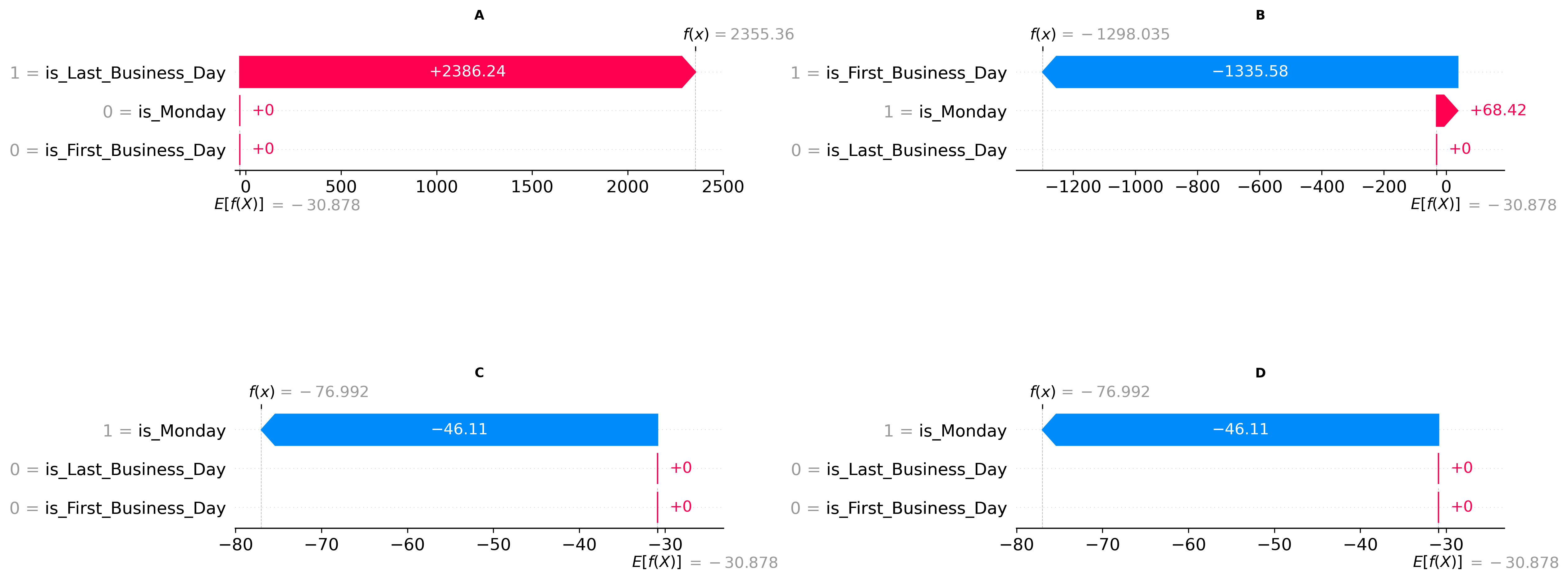
Looking at our local maximum, we observe that the Last Business Day feature provides the dominant contribution, pushing the prediction (f(x) = 2355.36) significantly higher than the universal baseline prediction (E[f(x)] = -30,878). As anticipated, for our local minimum, the First Business Day feature is the strongest driver of the model's prediction (f(x) = -1298.035). The model also identifies Monday as having a minor, but opposing, influence on this prediction. In our remaining two minima, the Monday feature emerges as the primary factor influencing the model's output (f(x) = -76.992).