Cumulative Gains Chart

This cumulative gain chart from evoML illustrates a model designed to classify websites as fake or legitimate. It shows the cumulative gain across different percentiles of the population. The gain from using the model's predictions is consistently higher than the baseline but lower than that of a perfect classifier until the population percentile reaches 0.58. After this point, the model’s predicted probabilities align with the performance of a perfect classifier.
Cumulative Gain Chart
Intuition
What is a Cumulative Gain Chart?
A cumulative gain chart is a tool used to assess the performance of a predictive model, particularly in cases where you want to target a subset of a population for some action (e.g., marketing, outreach). Here's the typical scenario where you might use a cumulative gain chart:
- The population of potential customers is large, and targeting the entire population is not feasible.
- The goal is to select only a fraction of the population most likely to respond (e.g., likely buyers, likely responders).
- The model assigns a probability score to each individual, predicting the likelihood of a positive response.
- The goal is to evaluate how well the model can help target the right individuals.
The cumulative gain chart provides a measure of how effectively the model captures a larger proportion of positive responses within the selected fraction of the population. The gain is the percentage of true positives (the group of interest) captured within the top x% of predictions.

Gain Calculation
For a given percentile of the population, the gain is calculated as follows:
- Select the top x% of the population, ordered by predicted probability for the positive class.
- Count the number of true positive responses in that subset.
- Divide that count by the total number of true positives in the dataset.
This measure quantifies how well the top x% of predictions capture positive responses. The x-axis of the cumulative gain chart represents the percentile of the dataset, and the y-axis represents the cumulative gain score.
Example
Let's break this down with an example:
- Cls: Actual class (response: Yes/No)
- Score: Model's predicted score (probability of positive response)
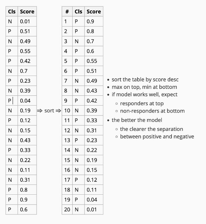
Explanation:
- Suppose we select the top 20% of records.
- In this subset, we find 3 out of 4 records are positive (responders).
- In total, there are 10 responders (positive classes).
- With only 20% of the records, we manage to target 3 out of 10 responders (30% of all responders).
Now, compare this to a random model, where:
- If we randomly select 20% of records, we expect to capture only 20% of responders.
- For 10 responders, this equals 2 responders.
This demonstrates that the model performs better than a random selection. The cumulative gain chart reflects this improved performance across all possible subsets.
Types of Classifiers in the Gain Chart
-
Perfect Classifier: A perfect classifier perfectly separates the positive and negative classes. In this case, the cumulative gain chart will always reach 1 at the point where the population's positive class is fully captured. From there, the curve continues along the x-axis, indicating that all positives are captured.
-
Random Classifier: The diagonal line represents a random classifier. If we select x% of records randomly, we can expect to capture x% of all positive cases. The further above the diagonal line the model's curve lies, the better the model's performance in capturing positives.
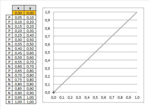
Example of Cumulative Gain Chart

In the cumulative gain chart above, the x-axis represents the percentage of the dataset selected, and the y-axis shows the percentage of responders captured. For instance:
- The first point on the curve for the Yes category is at (10%, 30%). This means that selecting the top 10% of records based on predicted probability will contain 30% of all true "Yes" responders.
- The top 20% contains 50% of responders, and the top 30% contains 70% of responders.
This process continues until the top 100% captures all the responders.
Reference: