Receiver Operating Characteristic Curve
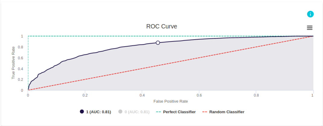
This example from evoML illustrates a model built to predict whether a client will purchase a coupon.
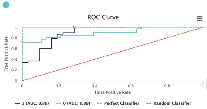
The ROC curve plots the False Positive Rate (FPR) on the x-axis and the True Positive Rate (TPR) on the y-axis for different threshold levels. The green line represents the perfect classifier, where the true positive rate is 1. This implies that a perfect classification model will classify all data points labeled as positive correctly as positive.
Looking at the ROC curve for this model, we observe that the curve stays above the random classifier and approaches the perfect classifier as the classification threshold increases.
ROC Curve
Intuition
What is a ROC curve?
A Receiver Operating Characteristic (ROC) curve is a graphical tool used to evaluate the performance of a classification model across all possible classification thresholds for the positive class. The ROC curve plots two parameters:
- True Positive Rate (TPR)
- False Positive Rate (FPR)
The ROC curve plots TPR vs. FPR at various classification thresholds. Lowering the classification threshold causes more items to be classified as positive, which increases both False Positives and True Positives.
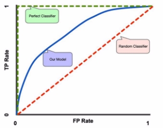
A good model should have a curve that is closer to the perfect classifier and stays above the random classifier in the graph.
Terminology
-
True Positive Rate (TPR): The proportion of actual positive instances correctly identified by the model.
-
False Positive Rate (FPR):

-
ROC curve (Receiver Operating Characteristic curve): A tool for measuring the performance of a classification model across all classification thresholds for the positive class.
-
Random Classifier: The baseline scenario. When AUC (Area Under the Curve) is approximately 0.5, the model cannot distinguish between positive and negative classes, essentially performing randomly.
-
Perfect Classifier: The ideal case. When AUC is 1, the model perfectly distinguishes between positive and negative classes.
-
AUC (Area Under the ROC Curve): A measure of the ability of the model to distinguish between classes.
Example
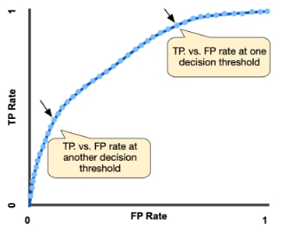
In Figure 2, we observe the TPR vs FPR at different probability thresholds. Initially, at a threshold of 1, no instances are classified as positive. As we decrease the threshold, more positive instances are identified, causing TPR to increase faster than FPR. However, after a certain point, FPR begins to increase more rapidly while TPR stagnates. This happens because, once the threshold is low enough, most of the positive instances have already been captured, and further lowering the threshold begins to label more negative instances as positive.
AUC: Area Under the ROC Curve
The Area Under the Curve (AUC) is the area between the ROC curve and the x-axis. It serves as a summary metric for evaluating a model’s performance. A model with a higher AUC is better at distinguishing between the positive and non-positive classes. The AUC ranges from 0 to 1: an AUC of 0 indicates a model with predictions that are completely wrong, while an AUC of 1 indicates perfect predictions.

References: