Kolmogorov-Smirnov Chart
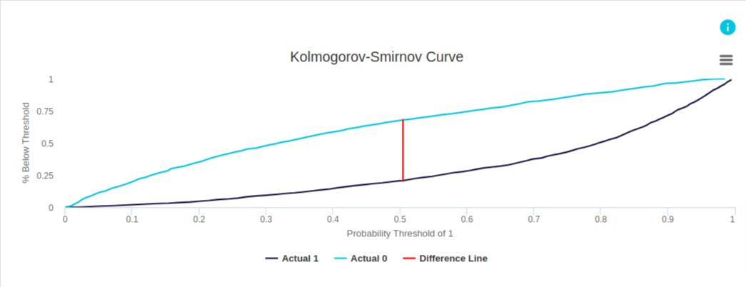
This example from evoML illustrates a model designed to predict whether a client will buy a coupon.
In the chart, the dark blue curve represents the target outcome (client buys a coupon), while the light blue curve represents the non-target outcome (client does not buy a coupon). Based on the data from evoML (not shown in this graph), at the point of maximum separation—where the difference line is drawn—the cumulative percentage of the non-target outcome below the predicted threshold is 0.68, while the cumulative percentage of the target outcome below the threshold is 0.21. The maximum difference, therefore, is 0.47.
Intuition
What is a Kolmogorov-Smirnov (K-S) Chart?
The Kolmogorov-Smirnov (K-S) chart is used to assess the performance of classification models, particularly in terms of how well they can separate positive and negative distributions. The K-S statistic ranges from 0 to 100:
- A K-S of 100 indicates perfect separation, where the predicted probability thresholds partition the population into two distinct groups—one containing all positives and the other containing all negatives.
- A K-S of 0 means that the model cannot distinguish between positive and negative cases, essentially making random predictions.
In most cases, the K-S value falls between 0 and 100. The higher the K-S value, the better the model is at distinguishing between positive and negative cases.
K-S Chart Mechanics
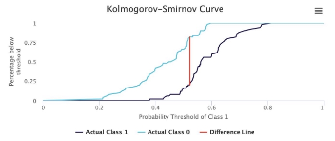
The Kolmogorov-Smirnov chart compares the cumulative distribution of predicted probabilities for positive (target) and negative (non-target) outcomes. The graph helps visualize the separation between the two classes at different probability thresholds.
- X-axis: Predicted probability thresholds, ranging from 0 to 1.
- Y-axis: Cumulative percentage of outcomes below each threshold.
A greater separation between the two curves indicates a better-performing model.
Example
The following chart shows the cumulative distribution of predicted probabilities for both the target (positive) and non-target (negative) outcomes. The model assigns a predicted probability between 0 and 1 to each outcome, and the cumulative percentages are plotted against the thresholds.

Explanation of Table Elements
-
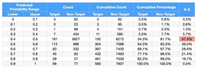
Predicted Probability Range: Defines ranges between 0 and 1, typically in 0.1 increments. This corresponds to the "Probability thresholds of 1" on the graph (Figure 3).
-
Count: Shows the number of target and non-target outcomes within each predicted probability range.
-
Cumulative Count: This column accumulates the count values, providing a running total of outcomes as we move down the table.
-
Cumulative Percentage: Calculated by dividing the cumulative count by the total number of outcomes in each category, then multiplying by 100. This represents the Percentage below threshold on the y-axis of the graph (Figure 2).
-
K-S Value: The K-S value represents the maximum difference between the cumulative percentages of the target and non-target distributions. It indicates the point of maximum separation between the two curves.
Summary
The Kolmogorov-Smirnov chart is a powerful tool for evaluating the separation between positive and negative classes in a classification model. A higher K-S value signifies better model performance, as it reflects greater differentiation between the two classes. This helps in assessing the quality of probabilistic predictions and determining thresholds for decision-making.
Let me know if you need more adjustments or have any questions!