Precision Recall Curve
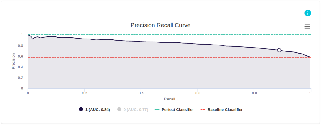
This PR curve from evoML is for a model that was built to predict if a client will buy a coupon. The dark blue line is the PR curve, and in this example, the PR curve is generated for the case where the model classifies datapoints as positive. (Note: If required, we can also choose the option at the bottom of the figure to see the model’s PR curve for classifying datapoints as negative.) The PR curve gives the precision and recall of the model at different levels of classification threshold. (Note: the classification threshold is not an axis in the graph).
When the model has only classified a few points (i.e., at low classification threshold), the precision of the curve is close to 1. Precision keeps dropping as classification threshold increases and reaches the baseline classifier at higher values of classification threshold. As indicated below the graph, AUC is 0.84.
What is a PR Curve?
A PR Curve stands for Precision-Recall curve and it is a tool for measuring the performance of a classification model at all classification thresholds for the positive class. ROC Curves and Precision-Recall Curves have similar interpretations but with different parameters, and provide a diagnostic tool for binary classification models.
This curve plots two parameters:
- Precision
- Recall
A PR curve plots Precision vs. Recall at different classification thresholds. Lowering the classification threshold makes the model classify more items that it is less sure of as positive, thus increasing recall while adjusting precision.
Example
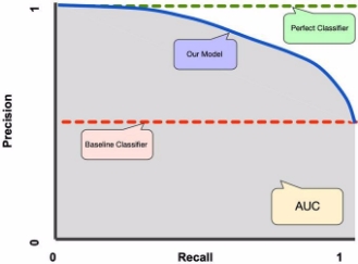
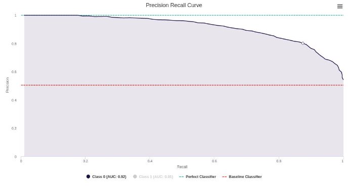
In Figure 2, we see the Precision vs Recall at different probability thresholds. At the start of the graph, we start at a threshold of 1, with no instances being labeled as positive. As we decrease the threshold, we start catching more instances of the positive class, increasing Recall. Meanwhile, at higher thresholds, the precision is high, as a (good) model is more sure of its classification of positive classes. However, as we decrease the threshold, we identify more cases as positive. The model is less sure of these points, thereby decreasing precision. As a result, we have a plot of the trade-offs between having a high precision vs having a high recall. In Figure 3, we can see different classifiers including our model classifier, perfect classifier, baseline classifier, and the AUC that is related to our model.
AUC: Area Under the PR Curve
The area between the PR Curve (our model) and the x-axis is called the Area Under the Curve (AUC) and is a way to aggregate the results of the graph to a single metric. AUC values range from 0 to 1. A model whose predictions are 100% wrong has an AUC of 0; one whose predictions are 100% correct has an AUC of 1. The higher the AUC, the better the model is at distinguishing between the positive class and the non-positive class.
Interpreting a PR Curve

It is desired that the algorithm should have both high precision, and high recall. However, most machine learning algorithms often involve a trade-off between the two. A good PR curve has greater AUC. In Figure 4 above, the classifier corresponding to the blue line has better performance than the classifier corresponding to the brown line.
!!! note
A classifier that has a higher AUC on the ROC curve will always have a higher AUC on the PR curve as well.
In Figure 4 we assume that the baseline classifier stands at 0.5 precision. This number is the proportion of the positive classes in the dataset (total number of data).
What is the need for a PR curve when the ROC curve exists?
PR curve is particularly useful in reporting information retrieval results.
Information retrieval involves searching a pool of documents to find ones that are relevant to a particular user query. For instance, assume that the user enters a search query “Pink Elephants”. The search engine skims through millions of documents (using some optimized algorithms) to retrieve a handful of relevant documents. Hence, we can safely assume that the number of relevant documents will be very less compared to the number of non-relevant documents.
In this scenario,
TP = Number of retrieved documents that are actually relevant (good results).
FP = Number of retrieved documents that are actually non-relevant (bogus search results).
TN = Number of non-retrieved documents that are actually non-relevant.
FN = Number of non-retrieved documents that are actually relevant (good documents that were missed).
ROC curve is a plot containing Recall = TPR = TP/(TP+FN) on the x-axis and FPR = FP/(FP+TN) on the y-axis. Since the number of true negatives, i.e., non-retrieved documents that are actually non-relevant, is such a huge number, the FPR becomes insignificantly small. Further, FPR does not really help us evaluate a retrieval system well because we want to focus more on the retrieved documents, and not the non-retrieved ones.
PR curve helps solve this issue. PR curve has the Recall value (TPR) on the x-axis and precision = TP/(TP+FP) on the y-axis. Precision helps highlight how relevant the retrieved results are, which is more important while judging an information retrieval system.
Hence, a PR curve is often more common around problems involving information retrieval.
References: