Cumulative Lift Chart
This example from evoML illustrates a model designed to determine whether a website is fake.
The Cumulative Lift Chart complements the Cumulative Gain Chart by providing a clearer picture of the "lift" or advantage that a machine learning model offers over random classification. While the cumulative gain chart shows the gain score, which can be interpreted in comparison to a baseline and a perfect score, the cumulative lift chart helps quantify the actual lift provided by the model’s predictions.
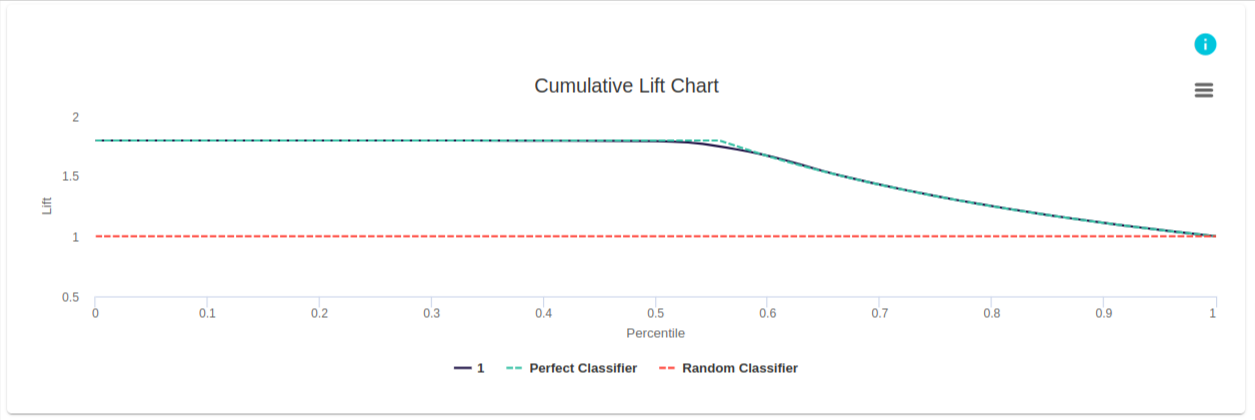
In this example, the chart demonstrates that for the given model, the lift remains around 1.80 up to the 50th percentile, after which it gradually decreases as the percentile increases.
Cumulative Lift Chart
Intuition
What is a Cumulative Lift Chart?
While the Cumulative Gain Chart provides insights into how much better a model performs over random classification, the Cumulative Lift Chart quantifies this improvement more directly. The lift score is simply the ratio of the gain score for a model at a given percentile, compared to the expected gain of a random model.
A lift score greater than 1 indicates that the model performs better than random selection, while a score less than 1 suggests worse performance.

The Cumulative Lift Chart plots the percentile of the dataset on the x-axis and the corresponding lift score on the y-axis.

How to Interpret the Cumulative Lift Chart
By comparing the lift scores across different models, we can identify which model provides the greatest advantage and at what point its effectiveness starts to diminish. A larger area between the lift curve and the baseline indicates a better-performing model.
Example Analysis
Cumulative gain and lift charts are powerful tools for visually representing the advantages of using a predictive model. The Cumulative Lift Chart specifically shows how much more likely it is to capture respondents by using the model as opposed to contacting a random sample.
For example, if you contact the top 20% of customers based on the model’s predictions, you can expect to reach approximately twice as many responders (~40%) compared to randomly contacting 20% of the customer base.
This graphically demonstrates the improvement in response rates that a well-calibrated predictive model can provide over random selection.
References: